LOGO & BRANDING
LOCATION
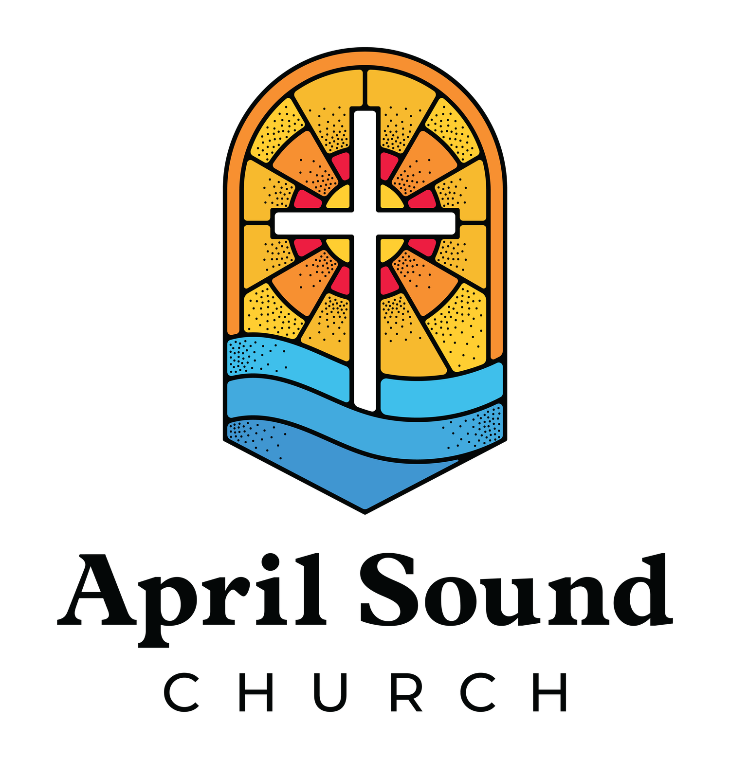
Shield Design reflects April Sound’s gated community
Water represents Lake Conroe
The top arch curve, stained glass, the cross, & Colors represent our iconic sanctuary stained glass
THEOLOGY
The light represents The Father, the cross represents The Son, and the water represents The Holy Spirit
The three waves of water also represent the Trinity
As an additional overall motif, the cross acts as a lifesaver which communicates our value of a simple gospel: that Jesus saves us from our sin.
The shield design communicates the importance of sound doctrine & sound faith.
CULTURE
The main font uses strong serifs, reflective of a hymnal while the subfont comes directly from modern industry-standard worship lyrics
Colors and iconography refer to our liturgical and interdenominational style
The flat minimalist design resonates with our desire to reach and impact our present time
These elements work together to bridge our ancient faith with today’s world.
NEW BRAND COLORS:
SECONDARY VARIATIONS:
Smaller applications will benefit from a less detailed logo mark for cleaner and easier visibility.


